In his previous book Understanding Comics
It looks like I was not alone in seeing the similarity. When I did a bit of research before penning this blog, I found an interview by Scott McCloud himself talking about this, as well as others.
 |
| Source: Austin Kleon |
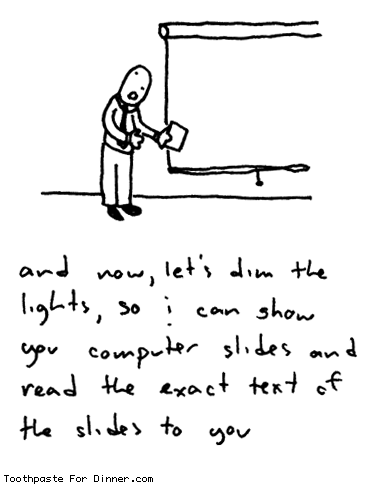
One easy and most common mistake that has been made over the years is the lack of pictures. And on occasions where there are indeed pictures, the compelling urge to drown it with words describing what the picture means.
 |
| Source: Call me Cassandra - Death by PowerPoint |
- Choice of moment: Picking what moments in a story to include and what not to
- Choice of frame: Picking the right angle and distance. In short, the right viewpoint to provide the right emphasis
- Choice of image: Picking the right image at the right level of detail
- Choice of words: Picking the words that go with the image
- Choice of flow: Picking the order of the frames that guides the readers from start to end
Similarly, the other aspects are equally important - picking the right bullets or emphasizing the right bullets to convey the message, picking the right images to add clarity to the text (or vice versa), and ordering the slides in such a way that it flows end to end in a cohesive manner.
Comic writers can tell you how much work goes to creating a newspaper comic strip or a full-fledged novel. It takes weeks of preparation and work to produce a comic that is typically devoured in 30 minutes or so. The same unfortunately, applies to a presentation as well. While it may not take a few weeks, it will at least take a few hours if not, a couple of days to refine a deck - but at the end of the day, if it gives the same level of immersion as a comic strip or a graphic novel, I think the effort spent is worth it.
He goes into a number of other details too long to mention in a simple blog entry, but definitely worth reading. Here's another example that pertains to the interaction between the words and pictures. Scott classifies the interaction into seven categories.
- Word-Specific: Words provide the information with pictures accentuating what the words say
- Picture-Specific: Pictures provide the information with words accentuating what the pictures say
- Duo-Specific: Both words and pictures say the same thing (added emphasis)
- Intersecting: Both work together, but also provide information independently
- Interdependent: Both work to provide meaning, but neither will provide the information alone
- Parallel: Each provide seemingly differing message that do not seem to converge
- Montage: Words conveyed as pictures
I feel that a little extra effort and some understanding of the basics, even if not from the same field, can go a long way in making one's craft far more superior than where it currently is. I know I myself am not there yet, but hope to get there soon. After all, how awesome it will be if we can immerse our PowerPoint-viewing audience in the same way as a comics immerses a kid?
No comments:
Post a Comment