Search This Blog

Showing posts with label presentation. Show all posts

Sunday, September 19, 2010

Comics and Presentation

In the last post, I mentioned how I felt the concepts behind a comic (strip or book) to be very similar to those behind a business presentation, when I read Scott McCloud's Making Comics book. I would like to expand on that.

In his previous book Understanding Comics - now a classic pertaining to field of comics, Scott McCloud defines the term comics as "Juxtaposed pictorial and other images in deliberate sequence, intended to convey information and/or produce an aesthetic response in the reader". It sounds a little academic. The crux of the definition is that comics is sequential art, where each frame is made of pictures and words to convey a message both individually and over the entire span. This definition fits equally well for presentations as well. After all, a presentation is nothing but a series of frames where each frame is normally made of words and pictures and conveys some information to the viewer.

It looks like I was not alone in seeing the similarity. When I did a bit of research before penning this blog, I found an interview by Scott McCloud himself talking about this, as well as others.

Source: Austin Kleon
So, "What is the benefit?", you might ask. After all, comics is not necessarily associated with serious stuff - like pitch decks or lunch and learn sessions. It's supposed to be read & throw, right? Wrong. Think about this - which one have you felt is more engaging - comics or presentations? Which one has kept you on your toes, completely engaged, immersed? If the two share a number of common traits, then how come a comic is so interesting and a presentation is not? Is it just because of the relatively dry content of a presentation or is it something beyond that? After all, when we write a presentation, we don't start with the intent of boring people to do death, do we? What can we learn from the comic art that we have loved and apply to our presentations as well?

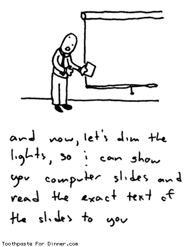
One easy and most common mistake that has been made over the years is the lack of pictures. And on occasions where there are indeed pictures, the compelling urge to drown it with words describing what the picture means.

Source: Call me Cassandra - Death by PowerPoint
Let's take a look at what Scott says on things that makes a comic and things that makes it work. A clear, persuasive, and intense comic (and from here on, you can freely replace the word 'comic' with the word 'presentation') has the following components.
  1. Choice of moment: Picking what moments in a story to include and what not to
  2. Choice of frame: Picking the right angle and distance. In short, the right viewpoint to provide the right emphasis
  3. Choice of image: Picking the right image at the right level of detail
  4. Choice of words: Picking the words that go with the image
  5. Choice of flow: Picking the order of the frames that guides the readers from start to end
The same rules govern a presentation as well. I have seen numerous instances (and in early days, I have fallen prey to this as well), where the writer tends to include a few slides either because it looks cool, or because they spent hours searching the Internet to get it and just didn't want the effort to go to waste, even though it does not add to the story. This is where the Slide Sorter mode in PowerPoint comes in. It lets you take a look at all the slides at slightly higher level and let you figure which ones to keep and which to remove. Comic writers (or any writer for that matter) go through this phase, and so should a presenter, if the aim is to make the presentation crisp and to the point.

Similarly, the other aspects are equally important - picking the right bullets or emphasizing the right bullets to convey the message, picking the right images to add clarity to the text (or vice versa), and ordering the slides in such a way that it flows end to end in a cohesive manner.

Comic writers can tell you how much work goes to creating a newspaper comic strip or a full-fledged novel. It takes weeks of preparation and work to produce a comic that is typically devoured in 30 minutes or so. The same unfortunately, applies to a presentation as well. While it may not take a few weeks, it will at least take a few hours if not, a couple of days to refine a deck - but at the end of the day, if it gives the same level of immersion as a comic strip or a graphic novel, I think the effort spent is worth it.

He goes into a number of other details too long to mention in a simple blog entry, but definitely worth reading. Here's another example that pertains to the interaction between the words and pictures. Scott classifies the interaction into seven categories.
  1. Word-Specific: Words provide the information with pictures accentuating what the words say
  2. Picture-Specific: Pictures provide the information with words accentuating what the pictures say
  3. Duo-Specific: Both words and pictures say the same thing (added emphasis)
  4. Intersecting: Both work together, but also provide information independently
  5. Interdependent: Both work to provide meaning, but neither will provide the information alone
  6. Parallel: Each provide seemingly differing message that do not seem to converge
  7. Montage: Words conveyed as pictures
In your next presentation, see if you can spot these variations. While each has its own purpose in life, most often we tend to overuse a few of the categories and more often than not, use one in place of another, thereby resulting in a poor presentation as a whole.

I feel that a little extra effort and some understanding of the basics, even if not from the same field, can go a long way in making one's craft far more superior than where it currently is. I know I myself am not there yet, but hope to get there soon. After all, how awesome it will be if we can immerse our PowerPoint-viewing audience in the same way as a comics immerses a kid?

Making Comics - A Review and a Teaser

Last week, I read a very interesting book - Making Comics by Scott McCloud. The author, I later came to know, is also the one behind the Google Chrome manual, which caused quite a sensation when it came out. The book itself is written in a comic format, true to the message it conveyed. Like any typical comic book, this was very easy to read and to understand, even though it covered much heavier concepts.

As a kid, and probably like any other kid of my time, I enjoyed reading comics, and still do. In India, the concept of a 'lending library' is quite popular - it's akin to a video library (such as Blockbuster) but for books. You become a member by paying a nominal fee and can borrow books - anywhere from a few days to a couple of weeks depending on the nature of the book - for a fraction of the actual price of the book. I am still not exactly sure if it violated copyrights of the book (although the model is similar to video libraries - so I guess it's OK) but it did expose me to a wide range of books to which I would otherwise have not had access.

In fact, so much was my craze that whenever our family moved to a new city, the first thing I would do is become a member of the nearest lending library (sometimes three or four). The comics available in India were primarily European (Tintin, Asterix, and the like), American (Archie, Disney, and a few such as Mandrake and Phantom imported via Indrajal comics) and local flavors like Tinkle and Amar Chitra Katha (ACK).

Comics were always an interesting read, primarily because of the mix of visuals and text, which suited my level of concentration as a tween. It was short, to the point, and fun. When I came to US, I was disappointed to find that most European comics were simply not available. I don't know if it was because of the tendency in USA to distinguish themselves from Europe (manifested in a number of ways) or just plain preference, but all I could find in bookshelves were either Marvel Comics (---man, fill the blanks for any word) or super-contemporary ones that I did not get. Recently, Japanese comics (Manga) seems to be the only non-US genre that has broken this barrier, and that too in a big way.

Of late, I have been wondering why Indian comics has not blossomed beyond Tinkle and ACK despite access to a rich treasure of stories from generations past. One thing led to another, and I started exploring the world of comics - to understand what makes a comic instead of just reading them, which led me to the book in question.

One of the general dilemmas one has when looking for a book about writing is the credibility of the author. If I want to read a book about comics, I expect the book to be written by an established comic writer. Same for a book on movie direction or story writing. However, I feel that this is wrong. Not all teachers of an art are accomplished in their area of expertise or vice versa (accomplished persons may not be good teachers). Barring a few (like Richard Feynman on teaching itself, or Stephen King and Ray Bradbury on writing), these two don't tend to meet and that is no reason to discredit a person's work.

Frankly, I had not heard of Scott McCloud till I read this book. Regardless of whether he is an accomplished comic writer himself, he seems to have an excellent grasp of the theory behind writing comics. He breaks down the concepts behind a comic in a simple yet profound manner. My only pet peeve with this book, probably due to my background as mentioned earlier, is that the book focuses primarily on the genre of comics sold in USA (graphic novels, manga, and contemporary comics) and skips almost entirely the European style of comics. I wish he had at least dedicated a chapter on it, given that it shaped the thoughts of the world outside USA.

Interestingly, as I got deeper into the book, I found myself increasingly comparing the concepts behind a comic book to those behind developing business presentations. Stretching it a little, I feel that some may even extend to the area of User Interface and User Experience.

I will expand on this correlation between comics and presentations in my next blog (hence the teaser part). In the meanwhile, if you are curious enough, I would definitely recommend picking up the book from your friendly neighborhood bookstore. It's an easy, fun, and thought provoking read. If you are more interested in knowing Scott McCloud a bit more, you can also view his TED presentation on comics.

Thursday, April 29, 2010

No stuff just fluff: Comparing Blackberry and Apple ads

It is amazing how some companies just refuse to listen and learn from others and are hell bent on being obstinate and pig-headed. At least this was the thought that ran in my head when I watched the promo ad for the upcoming Blackberry 6 OS.

It's kind of a given at this point that Apple is the unsung hero for all 'visual' thinkers. Every Apple show or unveiling is accompanied with oohs and aahs from bloggers on visual presentation, and rightly so. Apple (and some say, Steve Jobs) has refined the art of presentation and is constantly crediting for removing presentations from the shackles of bullets.

Much as I disagree with the tactics used by Apple in their iProducts, I can't help but appreciate their inventive ads - the ads embody the general rules that are identified in Heaths' Made to Stick book. In the book, the authors suggest that in order for an idea to stick in the viewer's mind, it should have the following qualities.
  1. Simple
  2. Unexpected
  3. Concrete
  4. Credible
  5. Emotional
  6. Story
Most of Apple's presentations and advertisements follow this format. They are simple, have an unexpected message (mostly related to the new product), have concrete information, comes from a credible source (in this case, authoritative, at least), has a cute little - most times youthful - song  that appeals to the target audience, and has a nice flow from start to finish (sometimes with a story).


This simple (well, simple in thought, but not simplistic) format has made superstars out of most Apple products. You would think that the competitors to Apple will take to heart what worked for the company and try to improve on it. But nooooooo, that's apparently not how the world works.

Case in point is the new promo bit from Research in Motion for their Blackberry 6 OS in their trade show. I like Blackberry. It's a great product - does what it's supposed to do and is fairly open to developers (better than Apple at least) and does not nickel and dime you for everything.

It is no secret that the iPhone, with all its billion apps, still has significant drawbacks as a decent technology product - lack of multitasking, lack of Flash, relatively low quality camera, etc. While the current OS (5.0) shares some of the problems, the new OS apparently does multitasking and a lot more.

The aim of the ad, at least as RIM intends, is to tell the consumers that the new OS will make the Blackberry a lot more seamless, user-friendly, powerful, and most of all, fun to work with. This is great, but look at the ad.


What's up with the dancing people? The background completely overshadows the foreground. During the whole ad, I was distracted by the dancing in the back, making it really difficult for me to focus on what's new with the OS - definitely not what I believe the intention is. How can a company still not learn - both from itself and from others? It boggles my mind.

The ad is not simple (especially not with all the background dancing and old-school music), it is not emotional (at least not the right kind - I believe they wanted to show that the OS is fun to work with via the dancing, but it annoyed me more than engage me), and it did not have a story (well, the screens flowed decently, but it was too difficult to focus on it with the artificial dancing in the background). The ad missed out on 3 of the 6 points mentioned above, effectively making it a failure.

It also goes to show the power of visual presentation - how fluff can in effect make it look like there is a lot more stuff - something that's important not just for people without stuff, but also for those that do. It is more tragic to see someone make the stuff look less important due to bad fluff than one who makes the stuff look better with fluff.

Wednesday, March 31, 2010

Bad Pronunciation and Good Presentation

A quick note to non-(South) Indian readers: The first part of this blog is a little topical and you may not relate to it. I have tried to provide an analogy to relate better, but I hope you can relate to the second part regardless of where you are from.

On my recent trip to India, there was one song that was played repeatedly in all the TV channels. It's a pretty nice, melodious number from one of the recent Tamil movies named Pasanga (Boys). It's been ages since I've seen any of the new movies, but the song stuck in my head. I think the song is about two young folks falling in love. Unlike many of the Indian film songs, thankfully the actors don't tend to sing and dance the number here and it is rendered more as a background number.

I forgot about it after I left.

Bad Pronunciation

Few months later, I was sampling through all the songs that I had gotten from India on my way to the office. Two songs stood out. One was a song called Maalai Neram (Evening Time) from a film called Ayirathil Oruvan (One in a thousand) and the other one, the song "Oru Vetkam Varudhe" (I am getting shy) - the one I mentioned earlier.

Maalai Neram (Evening Time) by Andrea Jeremiah in Ayirathil Oruvan


Oru Vetkam Varudhe (I feel shy) by Shreya Ghoshal in Pasanga


The songs stood out to me because they had a pleasing melody and because they both had unique voices (compared to others in the genre). As I started listening a bit more closely, I was all the more captivated by the second one and slowly started disliking the first. The reason - the singer of the first song, while having an excellent voice, butchered the diction. Her pronunciation was way off and it constantly distracted me from trying to enjoy the song itself, especially since I knew how it was supposed to be pronounced. On the other hand, the second singer rendered the song perfectly - with barely any noticeable variation in diction.

I know this sounds nitpicky. After all, music is supposed to be beyond language, right? Why not just forget about diction and enjoy the music itself? While agree to this philosophy and endorse it, I feel it is fine as long as you do not know the language. Knowing the language and understanding the meaning, I feel adds a few more layers of depth that you do not get with just the music.

For example, if you are a non-English speaker "Hotel California" by Eagles may be pleasing to you at first because of the guitar riffs at the beginning and the end as well as how the song progresses. For an English speaker, the song adds an extra depth not just because of the lyrics, but also because of the diction. Imagine the same song sung in a Karaoke fashion by Apu from Simpsons! The song goes on to add even more depth if you were a child of the mid '70s.

The irony in this case is that Andrea Jeremiah is a native Tamil speaker, while Shreya Ghoshal is not!

The trend of bringing non-native singers to sing in film songs especially because of their unique voice in Tamil is a new trend started a few years ago by A R Rahman (the 'Jai Ho' guy). While this is great and it added a new depth to the songs, not many have taken this task to heart. Many of the famous singers (Udit Narayan and Adnan Sami being the biggest of the culprits) have sung the song pretty much however they want with scant regard to the intricacies of the language in which it is sung, which I feel is a shame, as it robs the listener off a perception level. This cannot be just brushed aside as something that they do not know or are familiar with. There are others (notably Shreya Ghoshal and S P Balasubramaniyam) who have made a sincere effort to sing the song with as much accuracy as possible, trying to preserve the language of the song in the process. This, to me, makes them stand apart from others.

Good presentation

So far, whatever I've said may border along a rant. While it may be true, there are a number of other places where the same issue can have a more tangible impact. I will expand on two.

The first obvious one is when you travel to another country. While people may be curious about a tourist and may try to be helpful, it only goes so far. The curiosity will go away very quickly if the tourist does not respect the local culture. While some allowance may be given for a short while, it is not sustainable. On the other hand, if you attempt to understand and respect the others' culture even to a small degree and try to speak their language, it can go a long way in building trust (Avatar movie has this theme). I have experienced this in practice when I have worked with my China colleagues. While I don't understand the culture or speak the language, they become quite enthusiastic even if I say a "Hello" or a "Thank you" in their language. It has also helped 'break the ice' at times during conversations.

The second one is a little bit more subtle and one I can bet many of us do not do. It's about presenting our work better. As an IT professional, I end up creating a lot of documentation, typically in PowerPoint, Excel, or Word. For a long time, my focus has been on getting the documentation done (since it's done at the end of a project typically and I can't wait to get a break!) and not necessarily in making it pretty. However, over the last few years, I have come to realize that the style of presentation can have a subtle but significant impact on both your audience as well as on you.

Especially for Microsoft Office documents, there are some simple steps that you can take to make the documentation go from average to impressive. It takes probably a few hours at first to get this, but as time goes on, it becomes second nature. I have tried to explain this in a presentation that I put in Slideshare sometime back.


To me the content of the presentation is like the unique voice a singer brings to a song. It's what she was paid for. No one is going to complain as long as the singer does not screw up badly and sing the song with her special take on it.

The style of presentation (layout, typography, and use of visuals) is the pronunciation of the singer. It reflects how well the singer understands the target language (how relevant the graphics and typography are to the content) and how much effort she has put in trying to know the language better. When this caring shows up on your presentation, the presentation on the whole becomes well-crafted. There are fewer distractions in the document that takes the reader's mind away from the content and the reader will have the intangible feeling that it is appealing - and that could make a big difference in how well your idea is accepted, and is well worth the effort.

Can you think of a few other scenarios where such additional 'style' on top of 'substance' makes a noticeable intangible impact? If so, feel free to post a comment.

Saturday, July 25, 2009

A head nod to Indexed

A few months back, I was looking at books on visual thinking, inspired by Garr Reynolds' Presentation Zen and Dan Roam's Back of the Napkin and came across Jessica Hagy's Indexed.

At that time, while I found the book to be fairly intriguing, I didn't find it directly applicable to what I was looking for, as it did not have any instructions on how to be a visual thinker. Nevertheless, I put her blog in my Google Reader.

After having had a good background on visual thinking, thanks to the books I mentioned above, I look back and see the subtlety and depth in Hagy's diagrams. I am amazed by the level of creativity she has and the seemingly effortless way in which she can portray complex concepts in a simple x-y chart or a Venn diagram.

I thought I might as well make an attempt in creating such an index myself and here are a couple that I could think of.


I have been having interesting discussions with my Dad about religion and spirituality. He has his strong views, him being a devout religious person, and I, mine, trying to find a balance. While I won't call my diagram accurate, as the topic tends to be subjective in nature, I could see how creating a simple diagram can at least make thoughts a lot clearer and much more easy to understand. No wonder they said that a picture is worth a thousand words! It truly is.

Thursday, May 14, 2009

Better Documentation

One of the interesting things in IT I have seen so far is how people tend to learn less of what they use more. I call this Inverse law of IT learning. For example, we take training courses, read books, and participate in discussions about say, Weblogic or WebSphere or SAP or any other technology we tend to use sporadically in different projects. However, we barely tend to read a book or take a course about Microsoft Word or PowerPoint. We have come to see them equivalent to a DVD Player or a TV where we're just supposed to 'get' it without RTFM.

I don't think the analogy we developed applies much. Desktop publishing software such as the Microsoft Office Suite are much more complicated than Notepad for example. They are excellent tools to deliver quality documentation, if only we spend a little bit of time understanding them a bit more. I have seen experienced professionals spend minutes (which adds up significantly over time as we use Word almost every day) in cutting/pasting/selecting by fumbling with the mouse without knowing some basic keyboard shortcuts that can let them do the same in seconds.

We are more happy to crib about the 'user unfriendliness' of Microsoft Office than trying to spend a few minutes to understand the design and concepts involved, such as the Style library and Paragraphs.

I made a presentation (in the traditional death-by-bullets style) a while ago for my colleagues on how small tricks in Microsoft Office suite can significantly improve documentation that is produced daily by teams - be they defect reports, project status, or design documents.

While writing the presentation, I ended up reading Presentation Zen and Non-designers design book, which completely changed my perception on how to create presentations. You can see the final version in SlideShare. Please comment!