Search This Blog

Tuesday, October 26, 2010

Book Clubs taken to a new level?

With relatively little fanfare, Barnes & Noble, one of the largest bookstores in USA, released its new version of e-reader - Nook Color today. In the last post, I had mentioned how an e-reader experience does not come close to the real deal. At the same time, I mentioned that there are some areas (such as manuals and reference books) where an e-book can come in handy instead of having to lug around huge tomes. This is where the sweet spot for an e-reader to me is.

As an avid reader, one of the biggest attractions to me after I came to USA was Barnes & Noble - the wide selection of books, resident coffee shop, and more importantly, the freedom to sit down and thumb through books at leisure. During my bachelor days, I used to sit down for hours over weekend (and at times during weeknights) in the company of books (geeky, I agree). As an IT professional, this was very helpful since I couldn't afford the breadth of books required to keep myself up to date. I used to do my bit of paying back by buying coffee, snacks, their yearly membership, and occasional bargain books I could afford.

Eventually, Amazon came into being and B&N popularity declined, leading it to think about putting itself on sale. I have always felt that B&N missed a good opportunity by not capitalizing its brick and mortar stores and augmenting it with its online presence. In this era of instant gratification, it would have been nice to be able to order the book online at a price competitive with Amazon and be able to pick it up at the nearest store. I am sure that there are some pricing issues involved here, but it couldn't be any worse than losing the sale to Amazon!

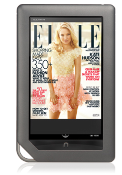
Similar opportunities were missed when Amazon introduced Kindle and it took a while for B&N to get in the bandwagon with the Nook. Now, almost a year after the old Nook, B&N has announced the release of Nook Color, the successor to Nook. At the outset, this does not sound like a good idea - Nook Color is customized version of an Android Tablet. So, it does not have the advantages of an e-reader (e-ink) or that of a tablet (app store and flexible OS).

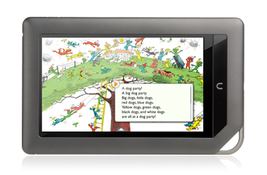
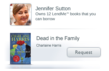
However, I think they do have two great ideas that compensates for the disadvantages - the Kids Store and the Social Networking angle. I personally am not a fan of putting kids books on an e-reader for the same reasons I had mentioned earlier - it does not carry the same emotions as that of a nice picture book held by you and your child. However, after having seen my nephews and nieces take to electronic gadgets so easily, I have reluctantly started accepting the harsher realities of life that the level of emotion attached to material things diminish as generations pass by. So, I think it is a clever move on B&N's part to introduce kiddie books on the Nook, something the Kindle and iPad have failed to capitalize.

 The other major idea is bringing social networking to reading, at least more seamlessly. I love the idea that you can 'lend' books to other 'Nook'ies. Many a times I have read a nice book that I wanted to share with others but also know that they may not really want to buy it - lending is perfect in these situations. Not only it builds a nice community, but also promotes the purchase of Nooks within these circles - it gives a whole new dimension to a book club. I can envision Oprah giving out Nooks in her next Book Club meeting!

In addition, the Nook Color also seems to have the qualities that I personally look for in an e-reader / tablet:
  1. Display color
  2. Render PDF files
  3. Expandable memory via SD cards or equivalent
  4. Additional features like music/video playback, a few games, and a web browser
There is still a question of execution. As of this writing, Nook Color is still a few weeks away from being available and I am not sure how good the device itself is. Assuming that it is decent, I hope for Barnes & Noble's sake that this causes a real revolution and evolves e-reading beyond what Kindle and iPad have been able to do.

Monday, October 04, 2010

Ponniyin Selvan and the pleasure of reading non-ebooks

Ponniyin Selvan (The son of Ponni) is a historic fiction novel created around King Raja Raja Chola, one of the most prominent and arguably the greatest kings of South India (circa 1000 AD) by R Krishnamurthi (aka Kalki), a very well known author/publisher/freedom fighter. The novel is considered a masterpiece and is an immense pleasure to read, all 1000 and odd pages of it.


Kalki (middle) shown in a depiction with the key characters of the novel
Krishnamurthi was also known for his weekly magazine Kalki that he started in 1941, which ended up becoming his nickname as well. One of the huge selling points of the magazine was in fact, his novels that were published as a continuing story that would last for a few years. The magazine is still keeping that format in tact, even after seven decades in print.

One big pastime for subscribers of the magazine was to rip the pages containing the story to make the whole novel. This was before even buying books were a common occurrence. My grandfather had such a compilation of the story when it was published around 1970. As a kid, I read the story multiple times (all 1000 and odd pages) during my summer vacations at his house, mostly on the front porch on idyllic summer afternoons. Such was the simplicity of Kalki's writing that even a teen like me could easily understand such a complex story. The novel was so powerful that after I finished reading it, I would still be stuck in the eleventh century for a few days, and even wish that I were born then!

What was equally fun for me was not just the story itself but all the additional snippets that were captured as part of the compilation - tidbits, jokes, even advertisements from 30 years back - it was kind of Norman Rockwellesque in some sense in that they were temporal snapshots and took me back in time, most appropriate given I was reading a period novel. The faded and aged look of the pages added to the authenticity. To make things sweeter, the print was also accompanied by the original drawings of Maniam, Kalki's favorite artist, which were exquisite.


I could never bring myself to read the book in a published novel form, even though the story was the same. Somehow, the charm of reading that battered compilation of magazine articles was more authentic than reading a crisp, neatly printed novel, even if it had all other elements. I missed the ads, the 70s humor of rettaival rangudu, an impish boy and his antics scattered around in some of the pages, and occasional and completely outdated "Did you know" articles that were amusing.

As we progress in the publishing media and try to replace a mechanism that has stood strong for 400 odd years by e-books, I wonder if we will lose some of that authenticity and the ability of books to transfer us back in time not just by words, but also by the look and feel. After all, emotions are triggered by the senses and not just by the mind alone. The same novel in an e-book feels even more fake to me and I don't feel the attachment I felt when I read those bound pages. Somehow our books are becoming less personal and more mechanical - and I don't know if it's such a good idea.

I would love to have an e-reader for a host of other reasons (for reading impersonal manuals, for example), but I feel that a printed book still has its rightful place - to cozy up to in bed, while on a porch, on a sandy beach, and for so many other places - it just feels right.

Sunday, September 19, 2010

Comics and Presentation

In the last post, I mentioned how I felt the concepts behind a comic (strip or book) to be very similar to those behind a business presentation, when I read Scott McCloud's Making Comics book. I would like to expand on that.

In his previous book Understanding Comics - now a classic pertaining to field of comics, Scott McCloud defines the term comics as "Juxtaposed pictorial and other images in deliberate sequence, intended to convey information and/or produce an aesthetic response in the reader". It sounds a little academic. The crux of the definition is that comics is sequential art, where each frame is made of pictures and words to convey a message both individually and over the entire span. This definition fits equally well for presentations as well. After all, a presentation is nothing but a series of frames where each frame is normally made of words and pictures and conveys some information to the viewer.

It looks like I was not alone in seeing the similarity. When I did a bit of research before penning this blog, I found an interview by Scott McCloud himself talking about this, as well as others.

Source: Austin Kleon
So, "What is the benefit?", you might ask. After all, comics is not necessarily associated with serious stuff - like pitch decks or lunch and learn sessions. It's supposed to be read & throw, right? Wrong. Think about this - which one have you felt is more engaging - comics or presentations? Which one has kept you on your toes, completely engaged, immersed? If the two share a number of common traits, then how come a comic is so interesting and a presentation is not? Is it just because of the relatively dry content of a presentation or is it something beyond that? After all, when we write a presentation, we don't start with the intent of boring people to do death, do we? What can we learn from the comic art that we have loved and apply to our presentations as well?

One easy and most common mistake that has been made over the years is the lack of pictures. And on occasions where there are indeed pictures, the compelling urge to drown it with words describing what the picture means.

Source: Call me Cassandra - Death by PowerPoint
Let's take a look at what Scott says on things that makes a comic and things that makes it work. A clear, persuasive, and intense comic (and from here on, you can freely replace the word 'comic' with the word 'presentation') has the following components.
  1. Choice of moment: Picking what moments in a story to include and what not to
  2. Choice of frame: Picking the right angle and distance. In short, the right viewpoint to provide the right emphasis
  3. Choice of image: Picking the right image at the right level of detail
  4. Choice of words: Picking the words that go with the image
  5. Choice of flow: Picking the order of the frames that guides the readers from start to end
The same rules govern a presentation as well. I have seen numerous instances (and in early days, I have fallen prey to this as well), where the writer tends to include a few slides either because it looks cool, or because they spent hours searching the Internet to get it and just didn't want the effort to go to waste, even though it does not add to the story. This is where the Slide Sorter mode in PowerPoint comes in. It lets you take a look at all the slides at slightly higher level and let you figure which ones to keep and which to remove. Comic writers (or any writer for that matter) go through this phase, and so should a presenter, if the aim is to make the presentation crisp and to the point.

Similarly, the other aspects are equally important - picking the right bullets or emphasizing the right bullets to convey the message, picking the right images to add clarity to the text (or vice versa), and ordering the slides in such a way that it flows end to end in a cohesive manner.

Comic writers can tell you how much work goes to creating a newspaper comic strip or a full-fledged novel. It takes weeks of preparation and work to produce a comic that is typically devoured in 30 minutes or so. The same unfortunately, applies to a presentation as well. While it may not take a few weeks, it will at least take a few hours if not, a couple of days to refine a deck - but at the end of the day, if it gives the same level of immersion as a comic strip or a graphic novel, I think the effort spent is worth it.

He goes into a number of other details too long to mention in a simple blog entry, but definitely worth reading. Here's another example that pertains to the interaction between the words and pictures. Scott classifies the interaction into seven categories.
  1. Word-Specific: Words provide the information with pictures accentuating what the words say
  2. Picture-Specific: Pictures provide the information with words accentuating what the pictures say
  3. Duo-Specific: Both words and pictures say the same thing (added emphasis)
  4. Intersecting: Both work together, but also provide information independently
  5. Interdependent: Both work to provide meaning, but neither will provide the information alone
  6. Parallel: Each provide seemingly differing message that do not seem to converge
  7. Montage: Words conveyed as pictures
In your next presentation, see if you can spot these variations. While each has its own purpose in life, most often we tend to overuse a few of the categories and more often than not, use one in place of another, thereby resulting in a poor presentation as a whole.

I feel that a little extra effort and some understanding of the basics, even if not from the same field, can go a long way in making one's craft far more superior than where it currently is. I know I myself am not there yet, but hope to get there soon. After all, how awesome it will be if we can immerse our PowerPoint-viewing audience in the same way as a comics immerses a kid?

Making Comics - A Review and a Teaser

Last week, I read a very interesting book - Making Comics by Scott McCloud. The author, I later came to know, is also the one behind the Google Chrome manual, which caused quite a sensation when it came out. The book itself is written in a comic format, true to the message it conveyed. Like any typical comic book, this was very easy to read and to understand, even though it covered much heavier concepts.

As a kid, and probably like any other kid of my time, I enjoyed reading comics, and still do. In India, the concept of a 'lending library' is quite popular - it's akin to a video library (such as Blockbuster) but for books. You become a member by paying a nominal fee and can borrow books - anywhere from a few days to a couple of weeks depending on the nature of the book - for a fraction of the actual price of the book. I am still not exactly sure if it violated copyrights of the book (although the model is similar to video libraries - so I guess it's OK) but it did expose me to a wide range of books to which I would otherwise have not had access.

In fact, so much was my craze that whenever our family moved to a new city, the first thing I would do is become a member of the nearest lending library (sometimes three or four). The comics available in India were primarily European (Tintin, Asterix, and the like), American (Archie, Disney, and a few such as Mandrake and Phantom imported via Indrajal comics) and local flavors like Tinkle and Amar Chitra Katha (ACK).

Comics were always an interesting read, primarily because of the mix of visuals and text, which suited my level of concentration as a tween. It was short, to the point, and fun. When I came to US, I was disappointed to find that most European comics were simply not available. I don't know if it was because of the tendency in USA to distinguish themselves from Europe (manifested in a number of ways) or just plain preference, but all I could find in bookshelves were either Marvel Comics (---man, fill the blanks for any word) or super-contemporary ones that I did not get. Recently, Japanese comics (Manga) seems to be the only non-US genre that has broken this barrier, and that too in a big way.

Of late, I have been wondering why Indian comics has not blossomed beyond Tinkle and ACK despite access to a rich treasure of stories from generations past. One thing led to another, and I started exploring the world of comics - to understand what makes a comic instead of just reading them, which led me to the book in question.

One of the general dilemmas one has when looking for a book about writing is the credibility of the author. If I want to read a book about comics, I expect the book to be written by an established comic writer. Same for a book on movie direction or story writing. However, I feel that this is wrong. Not all teachers of an art are accomplished in their area of expertise or vice versa (accomplished persons may not be good teachers). Barring a few (like Richard Feynman on teaching itself, or Stephen King and Ray Bradbury on writing), these two don't tend to meet and that is no reason to discredit a person's work.

Frankly, I had not heard of Scott McCloud till I read this book. Regardless of whether he is an accomplished comic writer himself, he seems to have an excellent grasp of the theory behind writing comics. He breaks down the concepts behind a comic in a simple yet profound manner. My only pet peeve with this book, probably due to my background as mentioned earlier, is that the book focuses primarily on the genre of comics sold in USA (graphic novels, manga, and contemporary comics) and skips almost entirely the European style of comics. I wish he had at least dedicated a chapter on it, given that it shaped the thoughts of the world outside USA.

Interestingly, as I got deeper into the book, I found myself increasingly comparing the concepts behind a comic book to those behind developing business presentations. Stretching it a little, I feel that some may even extend to the area of User Interface and User Experience.

I will expand on this correlation between comics and presentations in my next blog (hence the teaser part). In the meanwhile, if you are curious enough, I would definitely recommend picking up the book from your friendly neighborhood bookstore. It's an easy, fun, and thought provoking read. If you are more interested in knowing Scott McCloud a bit more, you can also view his TED presentation on comics.

Monday, September 13, 2010

Sandhi Ganesha

Yesterday was Lord Ganesha (Elephant God in Hinduism)'s day. In India, Ganesha is also known as a knowledge provider. He is purported to have written the Mahabharata under Saint Vyasa's direction.


As kids, it was absolutely crucial for us to worship Ganesha before any exam and most importantly Mathematics (not really sure why). The more devout, such as those who desperately need to pass the exam, would break anywhere from 1 to 108 coconuts (Ganesha's favorite) depending on the strength of their hand and wallet.

Unlike most Gods, it is never too difficult to find a Ganesha idol for worship in India - especially South India. There is pretty much an unwritten rule that if there is a 'T' junction, there MUST be a small Ganesha statue in that corner facing the street. In most cases, the house forming the broader side of the T ensures this. Some such Ganeshas tend to become more popular and eventually transform into a bigger shrine with proper worship. There used to be one on the way to school which I used to visit regularly. I don't know if it helped me study better, but it at least improved my confidence!

The Sanskrit word for junction is 'sandhi'. While sandhis refer to street junctions, they also refer to conjunctions within the language such as one that is formed by combining two words together.

While English does not have too many sandhis (may with the exception of I'd, We'd, aren't, etc.), I believe the underlying Latin does use it liberally, giving rise to many English terms. In Sanskrit, sandhis are used all over the place - for poetic, aesthetic, and probably egoistic reasons as well (for the poet to show his language prowess).

The downside with sandhis in Sanskrit is that depending on how the word is split by the reader, it can give a completely different meaning, which has led to a number of interpretations for almost every Sanskrit text ever created!

My grandfather used to give us a very hilarious example to highlight the importance of understanding the rules of splitting the terms to get the right meaning, and interestingly, it involves a verse praising Ganesha, the king of sandhis.

गजाननं भूतगणादि सेवितं कपित्व जम्बू फलसारभक्षितं ।
उमासुतं शोकविनासकारणं नमामि विघ्नेश्वर पाद पङ्कजं ॥
It translates as follows:
GajAnanam: O Elephant Lord
Bhootaganaathi Sevitham: Worshipped by the disciples of Shiva (bhoota ganas)
Kapitva Jambu PalasAra Bhakshitam: Likes fruits such as Elephant Apple (Kapit) and Black Plum (Jambul)
Umasutam: Is with Uma (Parvati) - wife of Shiva and mother of Ganesha
Shoka vinAsha kAranam: Reason for destroying all sadness for his devotees
Namami vigneshwara pAda pankajam: I surrender to your feet soft as lotus petals

Now, my grandfather's version is slightly different - the words are the same but they are just split differently

गजानानाम्बू  धगनादी सेवितं
कपित्वजम्बू पलासराबक्षितम
उमासु तमसो कविनाशाकारानाम
नमामि विग्नेश्वर पाद पंकजम

The translation now becomes this:
gajAnanambu: One who wears an elephant flower (bu -> phoo -> flower in Tamil)
daganAdi sevitam: Burns all those who worship him
kapitva jambu: Jumps like a monkey (kapi = monkey)
palasAra bakshitam: Devours all snacks given to him
umAsu: Brought bad name to Uma (Parvati)
tamSo: (I forgot what this one was - nothing pleasant I can assure you!)
kavinAshakAranam: Responsible for the demise of all poets who sing his praise
namami vigneshwara pAda pankajam: I worship one with such qualities!

Same words, but completely different meaning! It goes to show the importance of learning something properly and understanding the intended meaning and not a screwed up interpretation - something current religious scholars who (mis)interpret the original intention of various religious texts without putting it in context need to desperately learn!

Hope Lord Ganesha gives them such strength :)

Having your cake ... and eating it too! 3 Operating Systems in 1

It's very hard to have your cake and eat it too, so to speak - but not in the case of Operating Systems! A while back, I had blogged about Ubuntu and how it is as good, if not better than Windows for everyday use.

While Ubuntu (10.04) has served me well as a server, it still had its issues in terms of general user acceptability. After all, everyone is so used to the Windows look and feel that it is hard for them to see a slimmer version with better functionality. Mac as always has its fans for its cool docking bar at the bottom and the jumping icons, but the rest of the OS is not necessarily useful, save for the artistically inclined.

But what if there is something that has the best of all three worlds? Wouldn't it be cool? For years, Mac users on Windows have used different themes to make Windows look like a Mac. I don't think the reverse is true - for that matter, I am not even sure if there are themes for Mac. In any case, beauty is only skin deep and what counts is the stuff within. However, no one said no to a good looking skin on a good looking body, right?!

Enter a few additions to Ubuntu that makes it not only look like Mac but also like Windows, at the same time! And you can do this three simple steps.

  1. Install the latest Ubuntu (10.04)
  2. Install Awn (Avant Window Navigator) via Ubuntu Software Center. This will add the very nice Mac Dockbar with all its features
  3. Install Win2-7 pack from Gnomelook.org. This will completely change the theme of Ubuntu to make it look exactly like Windows 7!
Normally with Windows, most themes hog memory like crazy and slow the system down, but thanks to Ubuntu's underlying sound architecture, there seems to be barely an effect on the system performance with this theme.

Who says I can't have my cake and eat it too?!

Sunday, August 15, 2010

Independence from our actions

Today is India's day of independence from the British rule in 1947, paving way for India to become the largest democracy in the world. News sites and TV channels in India have been running 'specials' about the Independence a few days before things get back to status quo. While India has achieved independence from external influences, I don't think we can achieve full independence till we are free of our own actions and behaviors. Let me explain.

Yesterday, I attended a function in a temple here in USA. The preparation for the function was excellent complete with a very artistically done rangoli (an art made of colored powder, typically made of rice flour, turmeric, or other such ingredients). As with many other temples, photography and videography using any device is prohibited in the main area and numerous warning signs/requests are posted all around.

Even with all this, I still saw one person (at least) who was busy taking pictures of both the art as well as the rest of the temple (including the main deity). While she did stop taking the pictures when the signs (that were quite obvious) were pointed out to her, it made me wonder why she did it in the first place.

The argument I can imagine coming from her is - "The art is very beautiful. I may not be coming here any time soon. So I want to capture it for my personal reference" - the argument is not unlike one made when downloading a song from a file share site. "What is the harm if I do something just for my own sake?"

In the book Diffusion of Innovations, the author refers to this argument as the "Tragedy of Commons", attributed to Garrett Hardin. The core of the dilemma is "Each individual pursuing a rational course of behavior that ironically drives the entire system to disaster", which to me, is what is ailing India at this point - the notion that our small actions will not have an impact on the greater system. Such behavior is obvious in various strata of life - be it giving a small bribe to the traffic cop when making an illegal move, not adhering to the posted rules, or improperly disposing trash, and so on. While it is true that the tragedy of commons is a complex solution that involves both system-level corrective actions as well as individual, there are some steps that can be taken without resorting to a system blame.

To me, when someone violates simple rules that can otherwise be observed without significant ramnifications for purely selfish reasons, they lose all rights to complain about the larger system, since they are effectively contributing to the larger system's downfall in their own capacity. Malcolm Gladwell in his book Tipping Point, refers to the broken windows theory - if a window is broken in a house and not repaired, it slowly propagates a level of carelessness or apathy within the system that eventually makes the whole neighborhood look rundown. This is especially very visible in India in the form of street litter, to take one example.

What it seems is required is not just freedom from external influences, but really freedom from our own internal actions - be it adhering to a "No Photography" sign in a temple or doing what it takes to get our work done without succumbing to bribery. The "Tragedy of Commons" can also be turned around in its head to become "Wisdom of Crowds" - if each of us adhere to rules as much as we can (and as much as it makes sense), we can help make the system better - eventually.

As they say, "charity begins at home".

Independence is about hope - hope for a better life and a better world - let's hope that we achieve independence, not just from external actions, but also those of our own that are not desirable.

Monday, August 09, 2010

Will we ever be alone with our thoughts again?

For the last few weeks, I have been heads-down reading a book I had abandoned half way through a few years back. A classic in its field, the book is called Diffusion of Innovations, a book that I think I came across through a citation in the more popular Tipping Point by Malcolm Gladwell. I am glad I picked up the book and more importantly, was able to finally finish reading it! I gained some very interesting insights which I hope to share with you in the upcoming posts.

In the meanwhile, as part of my daily browsing ritual, I came across this interesting article in Gizmodo. Needless to say, the picture was a huge incentive for me to click through the article although it had very little to do with the post itself (clever marketing ploy, I must admit!) What kept me reading through the article however, like any movie with a flashy promotion, the content itself, which resonated strongly with me.

Back in the days when technology was a luxury rather than part of life, I used to spend (and probably so did you) generally daydreaming or just plain lost in thoughts. Some of my fond memories of childhood involved creating stuff out of clay with my cousin, inventing new games, or just lying down under the shade of a tree for hours. However, of late, my every spare minute is mostly consumed with checking Facebook, Blackberry, or browsing aimlessly though I know that there is nothing to check and there is no new message that is life-threatening.

While I don't think I have degraded to the extremes mentioned in the article, I have been guilty of sneaking a glance at my Blackberry while at a signal, walking from the car to the store, or checking for messages that are not there when the person I am with is on another call or simply stepped out for a minute.

As much as the new age of connectivity is trying to bring people together, I think it is also prying us apart from our inner thoughts, which I don't think is a good thing. As Elizabeth Gilbert said in her TED talk, sometimes inspiration comes in waves and to me it's many times when you are lost in thought or even just alone. By letting the waves pass us by because we are already consumed with the Pavlovian pings of the Blackberry, I think we lose golden opportunities to get innovative and get in touch with ourselves and wonder if we, or our future generations will slowly start losing this process of thinking long term and instead get lost in the then and the now.

While I can hear my wife saying "I told you so" behind my back, I think it is important to take some time out and just be lost in our thoughts so that we can find ourselves once again.

In the end, I want to leave you with one image from my favorite artist, that sums up the feeling.

Wednesday, July 14, 2010

Tweaking thought-less designs

Bad design usually sticks like a sore thumb. By design, I am not talking about IT-centric designs such as user interfaces for Blackberry, iPhone, etc. I am talking about design that is a part of what we interact with in our everyday lives - beds, sofas, doors, streets, and so on. Every element that we interact was designed by someone, for good for bad. Bad designs are easy to find, such as narrow streets, buildings with only one exit, etc.

However, design that is not so bad but at the same time could be better is not easy to find. It is more like an irritant. We know that something is wrong, but we can't quite place it. It may gnaw our minds for the few minutes before and after we interact with it and goes away till we interact with the same piece again. Recently, I came across such a design that prompted me to write this post. Now, I am not really ranting about the design (although blogs are rants in most cases). Instead, I am posting this to see if any of you who come over here have experienced such nagging as well and hopefully knowing that the nag has a reason may help you be more at peach - a noble goal indeed!

The design in question is simple - a restroom. Rather, the sign to a restroom. The picture below is the corridor in my office building that I rarely visit. By looking at it (the viewpoint from when you get into the corridor), can you figure out where the restroom is?


I had the same issue. While thankfully I was not in a hurry to reach the said destination, it did take me a wrong turn and some careful looking on either side to find the right place (the different gender rooms are on either side of the entrance).  Of course, there is a nice little universal sign in front of the door that indicates my destination. However, I could not see it until I was right in front of the door.

While this design is in general adequate and acceptable, it could have been made a lot better with just a simple tweak - make the sign perpendicular to the door so that it sticks out in the corridor (probably near the ceiling so that it does not hit someone in the face). This way, it will be fairly easy for someone to know where the restroom is without having to look at each and every door! It does not really cost much to make this change, but can make a difference in simple comfort.

Another example I have seen is the way doors swing in a cafeteria. For example, it's probably more useful to set up the doors such that you push when getting out of the cafeteria and pull when you are going in. This way, if you have your hands full with food, you just push the door. However, I have seen this being done the other way.

I am sure if we look into the software we write or use everyday, such simple to fix issues can be found in many places that only required a little extra effort to make a difference. Some good books to read in this regard are The Universal Principles of Design and The Design of Everyday Things. Hopefully it helps in increasing your attention to detail. It definitely helped for me.

Can you think of such minor annoyances for which you could see some simple fixes that would make just the difference required? Please post a comment.

Monday, July 12, 2010

Eggless Date Cake Recipe

It's rare to have a fairly large family event for me, especially when away from my home country and when most of my relatives are spread far and wide here. So, I was quite enthusiastic when we (my wife and I) invited a few of our relatives along with their parents for a nice family time. Since all of us were reasonable food enthusiasts, we wanted to make some good food for all. The appetizers (veggie shish kebab, Bombay Chaats - Sev, Bhel, and Pani puris, Watermelon Juice), and entree (mixed veg pilaf, mint-coriander-cucumber raita, and lemon rasam, and yogurt with flattened rice) were all sorted out. The issue came when we tried to come up with a good dessert. Most in the group did not eat egg, and we were finding it difficult to come up with one that did not have any.

Cookies were an option, but we had a kid in the group who was not too keen on it. I thought of making some cupcakes that I had tried earlier, but finding a good eggless cupcake proved more complicated than I realized. There were quite a few vegan cupcake recipes, but somehow they were not appealing.

So, while looking around in the Internet in the last minute, I came across, Madhuram's Eggless Cooking website.The site had a Date Cake which looked quite interesting, especially since we had a bunch of Mejdool Dates my wife had brought from Dubai on her stopover from India a month back. Upon reading the recipe, I found that the cake was based on a recipe from Shilpa, the author of Aayi's Recipes. I have tried a few recipes from this site a while back, especially the fruit cake, for pretty much the same reason (eggless dessert) earlier. The fruit cake was a huge hit and I was wondering if I can repeat the success again.

The recipe is quite simple. I slightly increased the quantity of the recipe mentioned in order to fit a large French White pan as follows.

Ingredients
24 - 30 Mejdool Dates (any other dates, preferably soft)
1 cup 2% milk (any other milk would technically work, including Soy, as Madhuram had tried)
1 cup sugar
1 1/2 cup all-purpose flour
1 1/2 tsp baking soda
1/2 cup vegetable oil (I used Wesson Canola Oil)
2 tbsp chopped cashews
2 tbsp chopped walnuts

Directions
  1. Soak the dates in milk for an hour or two. If the dates or milk is cold or still hard, microwave it for a minute. The original recipe called for an overnight or at least 3-4 hours of soaking, but I did not have the time and the dates were quite soggy within an hour itself.
  2. Blend the dates with sugar in a blender till the dates are thoroughly mixed within the milk. Although I reduced the sugar compared to the original recipe, I found the final cake to be a bit sweet for my taste. If your dates are quite sweet, you might want to reduce the sugar by a tablespoon or two. 
  3. Transfer to a mixing bowl
  4. Add the vegetable oil and mix thoroughly. In the original recipe, Shilpa mentions that the cake comes out fine without the vegetable oil. Since this was my first attempt, I didn't play around too much with the low-fat version, although I did reduce the quantity relative to the original recipe. You might want to reduce it further (probably in the second attempt!)
  5. Mix the flour and baking soda separately and slowly add the combined ingredients to the wet ingredients in the mixing bowl. Add slowly and stir constantly to ensure no lumps are formed during the process
  6. Add the chopped nuts to the mix
  7. Grease a baking dish with oil and pour in the mixture.
  8. Pre-heat the oven to 350F and bake for 30 - 40 minutes until a knife or toothpick inserted at the center of the cake comes out clean.
  9. Cool in a cooling rack for an hour or so before attempting to take the cake out of the dish.
My relative gave a useful tip. Instead of greasing the dish, you can line the dish with aluminum foil and pour the mix on top. This way, you can simply remove the foil once the cake cools, enabling it to come off easily. I haven't tried this yet, but can see the logic in it.


For decorating the cake, I did a combination of both the recipes. I roasted some almonds in a skillet and placed it on top of each piece. In addition, I also prepared a frosting to go with the cake, especially for the kid. However, I chose an orange frosting instead of a butter cream frosting, since orange goes well with dates, as per my trusted Flavor Bible

Here's my recipe for the Orange frosting modified from this frosting recipe.

Ingredients
1 cup heavy whipping cream
2 tbsp sugar
1 tsp orange zest
1/4 cup orange juice, preferably freshly squeezed (might as well, since you need a fresh orange for the zest!)

Directions
  1. Pour the whipping cream in a bowl. Keep the bowl along with the whisk (or the blades of an egg beater) in the fridge for 20 minutes or so (or 5 minutes in the freezer if you are short of time)
  2. Whip the cream to form soft peak (the cream should form a semi-thick consistency). This will take about 5-10 minutes of vigorous whisking
  3. Add in the orange juice, sugar, and zest, and whisk further for a few more minutes till the mixture forms hard peaks (or thickens)
Initially I misread the instructions and added the juice and sugar before keeping in the fridge. While this didn't ruin anything, the frosting was not too thick, either because of this or because I didn't whisk long enough. In addition, once the frosting is done, either use it immediately or keep in fridge until further use. This is especially crucial for this frosting since orange juice is acidic in nature and if left at room temperature, will curdle the milk (which happened for my first batch!).

Finally decorate the cake with the frosting any which way you like. You can see the final creation below (thanks to Shruthi for the design). Needless to say, the kid was quite happy to see his name on the cake and more importantly, the cake turned out to be delicious.


So, one big thanks to Shilpa and Madhuram for sharing and re-sharing this recipe. Even if you are an eggitarian, this is still a great recipe to try and I can assure you that it will be loved by kids, and they won't even know that it's healthy!

Thursday, June 10, 2010

SCMAD Book available in Amazon

After a long wait, my book on Sun Certified Mobile Application Development (SCMAD) is finally available in Amazon! It took a while, but it's there. If you had purchased this book earlier and (hopefully) benefited from it, it would be great if you can write a review.

Tuesday, June 08, 2010

Wake up call to Bollywood

Over the weekend, I watched the newly released Hindi movie Rajneeti (Politics) by the veteran director Prakash Jha. The film is a re-interpretation of the great Indian epic, the Mahabharata, with a liberal sprinkling of Mario Puzo's Godfather and references to current Indian politics thrown in for good measure. Jha makes no bones about it being a re-interpretation of the epic. While in TV interviews he tries to underplay the story adaptation, there are a number of subtle and not-so-subtle references to the characters in the epic that would let anyone who is familiar with the epic make the connection.


However, what I felt interesting was not the storyline, actors, or the direction, but the way in which the epic has been adapted to modern times and more importantly, how relevant the story still is in current times. Re-interpreting an older story is not something new. It has happened over the years and even Mahabharata has been re-created at least once (Mani Ratnam's Dhalapati) along with several others (Mani Ratnam's yet-to-be-released Raavan is another example, which is based on the other Indian epic, the Ramayana). Many other attempts have also been made in re-creating the stories as-is (historical epics) without any modification, although they have typically been successful only in parts.

As any grandmother in India will tell you, Indian mythology is stuffed with stories, either due to the long heritage dating back to thousands of years, or because the wise sages in the past understood the power of stories. Unfortunately, even with such a treasure trove of stories to pick from, the Indian film industry has always confined itself to a number of formulas that somehow is considered to be what the audience needs. This sad state of affairs has extended even to the TV soaps and serials that either fall into the slapstick or sob-story categories, that is, if they are not reality shows.

The argument that is typically made is that the stories of the past are not relevant anymore. When I was a kid, I used to be an avid reader of the kid magazine Chandamama and Amar Chitra Katha, both of which typically used to contain stories from past Indian texts. Recently, I read an article where the director of Chandamama was attempting to revamp the magazine to be more relevant. When asked why the magazine has declined in sales over the years, he said that the kids of recent times, especially engulfed in all the Disney and Nick cartoons, cannot relate to the characters of the past. They prefer Miley Cyrus over Yagnavalkya. He is right.

What tends to get lost in translation is that while the context in which the stories were created (kings and kingdoms) may not be relevant today, the stories themselves are immortal, as Jha's re-interpretation of Mahabharata shows. If only the directors and producers of the mass media today take time to re-read the stories of the past and analyze the crux of the stories than take them at face value, they will realize that they have a never-ending spring of stories that will last for centuries that can potentially make them rich along the way, while providing a wide variety to the audience than the narrow formulas that are spewed out today.

Beyond the selfish goal of making money, they would also do a favour to the masses by exposing them to the morals and values such stories embed in them, either knowingly or unknowingly.

Monday, June 07, 2010

What your grandma knew but you don't - The power of stories

Stories are an incredible form of communication and probably the most powerful. Numerous studies have re-affirmed the fact that our brain can understand visuals better than words. Stories are unique in that they are words portrayed visually, thereby bridging the gap between the two.

Since our brain has to process numerous things every second of the day and it is impossible and inefficient to record everything verbatim, it has chosen to record things in an abstract manner such that the gist is preserved without the entire content. Simple examples such as Gestaldt images as you see below are examples that our brain is excellent in forming the whole using incomplete parts.

 Can you see the dog in the picture?

Obviously, such condensation of information is not without its disadvantages. The first one is misinterpretation which occurs when the brain tries to create the reality from its gist but does so in a way that is different from the original reality. An example of this is the classic game that shows how rumors are created. The second and more subtle issue is that of creating a non-existent reality. The power of stories is so strong that when the brain is given a bunch of data points that do not necessarily fit together, it still tries to make up a story that makes it fit somehow, kind of like pushing a square peg in a round hole. This has been demonstrated by neuroscientists like Oliver Sacks in his book "The man who mistook his wife for a hat" and V S Ramachandran in his book "Phantoms in the Brain". Even so, such issues are overlooked by the brain in favor of the efficiency it gains by condensing information as stories.

Maybe realizing this tremendous power of stories, our ancestors across the world have chosen fables, parables, stories, dramas, and epics as the means to capture the wisdom gathered over the years in lieu of raw facts - or maybe it was the most natural form of information storage. Over the last few decades however, we seem to have ignored this idea of storing information within stories in favour of storing real facts. With increasingly cheaper storage mediums, it is probably logical for us to conclude that we should be storing raw data as opposed to processed information to avoid the fallacies of condensed information. However, we are overlooking the fact that even though the raw data is stored as is, our brain still processes information in a more abstract story format. Thus every person who reads the raw data has to create a story within his brain to make sense, which can still lead to misinterpretation. Moreover, such storage of raw data is typically done without the context in which it existed, thereby robbing crucial information that would be required for the reader to process the data later. This is where the story overpowers raw data in that it can also codify the context within which the data was created.

Such zeal in trying to store raw data in favour of stories can be seen everywhere. Presentations stuffed with bullet points are one such example. As many of the visual presenters such as Garr Reynolds in his "Presentation Zen" and more recently Carmine Gallo in "Presentation Secrets of Steve Jobs" will tell you, slides with a single "story line" coupled with a visual is far more appealing and impactful than a slide full of bullet points. The underlying principle however, is in trying to give raw facts as opposed to a story. You can see which one is more powerful. For example, here are two slides that summarizes this blog. Which one sticks in your mind better?

(You can purchase the image at http://www.istockphoto.com/stock-photo-3201212-amusement.php)

Google's philosophy is somewhat similar. It encourages users to store all the raw data in the world so that it can be retrieved easily at a future date. While one can argue that the 'more than 200 parameters' it uses to rank the results is equivalent of processing the data, it still does not come close to the effectiveness of a story, primarily because the context is lost along the way.

Recently, there seems to realization in the IT/Business sector of the power of stories. Books such as "The Story Factor" and "Made to Stick" are good examples. Even with such compelling evidence in favor of using stories as a medium of communication as opposed to raw data, we still tend to choose the latter, probably because it is the easy way out. It is far less time consuming to dump information in bullet points than to hunt for a visual and try to condense your message into a single line. However, we are making the mistake of allowing the users to create their own interpretation instead of providing ours to them.

The problem seems more intense in the IT industry compared to other areas. The whole movie industry thrives on stories. Industries related to arts such as cooking rely on apprenticeship, which is in effect, creating your personal story by observing data in context. Another known attempt was done a decade or so back by Peter Naur (famous for his Backus-Naur Form notation) in his article 'Programming as Theory Building' where he touched upon the notion that software design is in some sense akin to building a story.

However, when it comes to IT or even Business in general, we seem to ignore this powerful medium in favor of the much less efficient raw data. Those who break away from this mould such as Steve Jobs are seen as charismatic and visionary. I wonder if we can take a cue from our past and focus more on creating better stories than trying to deluge people with information.

Sunday, May 23, 2010

Mobile companies and their analogous countries

Sometimes when a problem is too big or too abstract to grasp, we tend to equate it to something we can grasp better. We call it an analogy. Dictionary.com gives this definition:
A similarity between like features of two things, on which a comparison may be based: the analogy between the heart and a pump.
There is also a different application to an analogy. You can use it to compare a new concept to a mature concept to get a sense of how the new idea might mature in future. While this of course is not perfect, it is a reasonable approximation.

Recently, I came across an article in Engadget called Is Android fragmented or is this the new rate of innovation?

The article led me to think beyond just Android and more about the mobile market in general, and even the companies that are responsible for the primary mobile platforms. I saw some interesting similarities between these platforms and how they are modeled and some of the leading countries in the world and how they operate. I felt it was a reasonable assumption as, after all, we are seeing the mobile platform spawn the world effortlessly. So, here's my analogy of the mobile platforms (and the companies) to some of the countries of the world.

iPhone / Apple : China
The first one of course, is the most popular mobile platform at the moment, the iPhone. 


The success of iPhone as come about due to the following factors.
  • Hundreds of applications at a relatively cheap price point
  • One single platform and phone model (with minor variations)
  • Tight grip over the user and developer base
  • Tight control / censorship over how information is disseminated over its platform
While you might argue that its design innovation is what made it the leader in the space, I would argue that the factors above are what has made it sustainable beyond the initial shock and awe. As you can see, the tenets are not too dissimilar from how China operates as well.

While China is the envy of the world and is fast gaining economic power, there is also resentment about the practices it has used to get there. The point of this blog is not to argue whether such practices are ethical or not - it is up to the larger population to figure out. Rather, to me, what is striking is the similarity in itself.

Interestingly, like China, while people grudgingly complain about the non-openness of the platform and authoritarian practices, they nevertheless go ahead and buy iPhones. 

Android / Google : USA
Google is fast becoming a major competitor in the mobile space. Already a world leader in the search space, the Android OS has positioned Google well to compete in the mobile area, which to Google, is another feed for its search domination.


Android (and hence, Google) has the following features.
  • It is based on a 'relatively' open platform 
  • Everyone is welcome to develop in the modified Java system, but the platform retains control over its future
  • It has an 'open' market although with a slant towards it's own powers (search)
  • It attempts to corral the rest of the industry towards standardization
  • The company promises to do 'no evil' (but may not be acting on it or perceived to be acting on it)
A lot of the fundamental principles to me seem to resonate with how the US Government operates. While in general, it tries to do more good than harm, there is general skepticism that it maybe doing it the other way around. People are cautiously optimistic about the new platform.

RIM / Blackberry : Canada
Research In Motion's Blackberry OS has become the de facto standard in business mobile usage. In that aspect, maybe it is not that similar to Canada, however there do seem to be some similarities.


  • The platform is loosely based on a more standardized platform (J2ME)
  • Even though the platform is quite open, it is still not as popular as it was expected to be
  • It is happy to be in its own space, without trying to influence others
I am always surprised at how the platform has really not tried to expand to other markets, even after other players such as iPhone have come in and at the same time also maintain its hold on what it does best. May be they follow the words of  Jim Collins in his book Good to Great to the dot, which is not to say that it's a bad thing.

Microsoft / Windows Mobile : European Union
The article I had mentioned earlier differentiates Windows and Android in the way they see the device and software partners. Since the beginning, Microsoft has always thrived on a license-and-partner relationship, which has worked to its advantage over the years.


Windows Platform has the following characteristics.
  • It works on a partnership model. Everyone pays a license to develop on the platform
  • The platform heeds to the needs of the partners and waits till everyone is on board
  • The overall fee structure is more expensive compared to other similar platforms
  • Change is hard to make and it takes a while to happen as well
It's also ironic that Windows platform is similar to EU, given its recent problems with EU! However, the partner model (and problems thereof) does seem to resonate well.

Oracle / J2ME : India
Finally, we have the Operating System that most platforms other than those mentioned above, are based on - the Java Micro Edition. I would potentially put Symbian in the same category as well.


Let us look at the defining characteristics and the similarities.
  • It's the most open platform compared to all others
  • It tries to please everyone and sometimes ends up pleasing no one
  • By trying to find a common minimum that will satisfy all devices, it tends to fall short of user expectations, leading users to create their own variant platforms
  • Being a 'democratic' system, it has little control over the devices where it is used, leading to significant fragmentation, which in turn, compounds the problem of trying to find a common minimum.
  • Even though it is a credible and viable platform, it is outdated and is fast losing its market relevance
To me, the J2ME platform's similarity to India is probably as striking as Apple's similarity to China. Interestingly enough, while both are hailed as leaders in their own way (largest democracy vs economic super power), they have their own differences.

While it may take a while for the countries to play out their roles, may be it will be interesting to see how the market reaction is to these mobile platforms, which in turn, may give a good indication of how the world will shape up - and I am not sure if the results we may see in future is something we may like to see ;)

Monday, May 17, 2010

"I am suing my company over Blackberry!"

If you own any of the smart phones that can receive emails such as a Blackberry or an iPhone, you are probably addicted to it by now. Jokes have been written about the wife divorcing the husband (or vice versa) due to excessive Blackberry usage. Personally, I can recall more than a few occasions where my wife has chided, scolded, yelled, and screamed at me for looking at my Blackberry on inappropriate moments - say, when she's talking excitedly about her new earrings or when I am at a red light in traffic.


While many talk about this phenomenon as yet another necessary evil, right after the Internet, is it really that unavoidable after all? As many of you would swear by it, Blackberry increases your productivity by making you more mobile and allowing you to work on your terms. One of my colleagues used to go on world-wide trips quite frequently. When I asked him how he got so much time to make those trips, he said it was because of his Blackberry. As a management consultant, his work was flexible and did not require him to be on a specific location 9 to 5. So, he used to get most of his work done at various times of the day, thereby giving him more flexibility in planning his vacation. Not everyone is as lucky.

As a downside, I end up working well beyond my normal working hours due to the emails that pop up in the evening or sometimes even at night - apparently there are a number of others like me who send the emails in the first place - and I don't get to go on vacations either! While you can argue that it is all about time management, the reality is probably close to mine than my friend's.

The other downside of the addiction is our diminishing value of etiquette. More often than not, you can see your colleague busily checking the new email that just arrived and potentially responding to it hurriedly in the middle of a conversation or more commonly, while at a meeting. To me, it is kind of equivalent to someone sitting and reading a newspaper or talking to someone else when you are talking to them. Our sense of priority has shifted. The email, even if it is spam, tends to get a higher priority over an active conversation just because the device beeped. Surprisingly, doing the same thing with a laptop is considered more offensive than with a Blackberry. Somehow, the diminutive nature of the device makes it more forgiving. I am guessing that when we get smart systems that are embedded near our ears and just read out our emails, it will become even less annoying, while being even more inappropriate.

The dangers of being addicted are not necessarily concerning only to the individuals who use such devices. I came across an interesting article in ACM Communications that implied that such addiction may actually prove legal grounds for an employee to sue his or her employer. Intrigued?

Nowadays, most smart phones are sponsored by the company (like mine) with the intention of creating the ideal scenario - giving more flexibility and making the employee more productive. However, if the organization also promotes either implicitly or explicitly, working beyond normal working hours, the employee can potentially argue that the company made him addicted to the phone. While there are a number of arguments that can be made for and against (flexibility vs. addiction), a plausible case may still exist, especially if the employee can go further and prove that such addiction caused physical or psychological problems (divorce, for example).

So, if the addiction is so disruptive is there anything we can do about it? How can we have a healthy obsession over our Blackberry while still not succumbing to its temptations at inappropriate moments? To answer this, we need to look at the reason why we are so addicted.

The concept behind Blackberry addiction is not new. The fundamental principle was proven by Pavlov a few decades back, in what is now famously known as the Pavlovian Effect.

Pavlov is most famous for "Pavlov's dogs." At the same time each day, Ivan Pavlov, would ring a bell to summon his dogs to eat. Pavlov noticed that the dogs would salivate at the ring of the bell, before they had begun to eat. This is called "Classic Conditioning". When provided a consistent stimulus, our brain reconditions itself to the stimulus so that it is tuned to that stimulus all the time. In the case of smart phones, from the original stimulus where the 'chime' meant an important email or message, the situation changes to an uncontrollable response for the 'chime' regardless of whether the message that follows is important or not.

Our smart phones are no different than the bell that the dogs responded to. We respond to them as soon as they vibrate, chime, or ring. We are conditioned to the tone. Much as the phones are "smart" and we are smarter, in the end, our primitive instincts have kicked in and have relegated us to the past centuries. However, maybe we can take a few steps to curb the instincts. This can be done by just two simple steps.
  1. Create a new profile in your phone, say "Home", where it will ring when it is a phone call and will be silent for all other reasons - meetings (hopefully not), emails, SMS, etc. Essentially, convert your "smart" phone to just a phone outside work.
  2. Once you reach home, keep your phone face down and away from the couch such that you have to get up in order to check it.
These two steps rob us of the three senses that are activated when a new email comes in (hear, see, and feel) - I am assuming that your phone does not taste yummy or smell great (or nasty)! As with any addiction, de-addiction does not happen in one fell swoop - you might find yourself checking the Blackberry whenever you cross it, and that's ok. At least it'll not be as instantaneous as you do now. Eventually you'll realize that the new frequency has not disrupted your routine as much as you were afraid of and it will become the new norm.

That's it. See if that makes a difference. Let me know by posting a comment.

Finally, remember one thing: years from now, you will not remember the countless times you responded promptly to an email during dinner or the times when your boss was mad at you because you did not respond late at night. However, you will remember the time when your wife didn't speak to you for three days because you responded to an email while having dinner and more importantly, your wife will remember the time when you complemented her new earrings ignoring the Blackberry chimes!

Wednesday, May 05, 2010

Parking Spots and Obama Healthcare Plan

Recently, I moved to a new apartment. The house is bigger and better, but with one flaw - there are no reserved parking spots. There are plenty of parking spots and they are all on a first-come-first-serve basis.

In my old apartment complex, there is one reserved parking spot per apartment and a bunch of 'floating' spots that can be used by visitors or even extra cars. This arrangement was quite good for me, as I have only one car and so I could park it quite close to my apartment.

The new apartment complex also seems to be relatively more affluent than my old one, and as a result, it looks like many of the residents have two cars on an average. These two factors - relative affluence and lack of reserved spaces - have combined together and typically result in lack of spots close to my apartment especially late in the night, such as when I get back from shopping. While there are still plenty of spots available in general, they are no more close to my apartment.

While I can look at it as a mandatory exercise that's probably good for my body, it gets a little frustrating to not have it close to home (maybe I am becoming too American - I can visualize my Dad giving a story about how he walked for a mile to school in the old days!). Overall, I felt that my previous apartment had a much better arrangement.

This led me to thinking about some of the 'socialistic' plans of the Obama administration.

A market-driven economy seems to be equivalent to my new apartment complex. It's purely democratic and whoever can meet the demand (empty parking space), get to supply (park the car). In general, this is great - it's purely meritocratic. However, as in the case of my new apartment, the trouble comes when there is an imbalance in the economy, such as when some people have more cars than average, and some less (rich vs middle-class vs poor). In this scenario, the ones who have more and are at the right place at the right time (reasonably affluent and gainfully employed) get to park all their cars at the prime spots (good healthcare at good hospitals). At the outset, this looks great - purely meritocratic, right? But what about the average Joe who has one single car and works late? He cannot park his car because someone with two cars took his place! Now would that be considered fair? Shouldn't Joe be assured at least one spot so he can park comfortably?

To me, this seems very similar to the ideal goal of partial Government intervention, a la Obama healthcare plan (other nuances and politics aside). The government should be responsible for providing at least certain minimal level of care (one parking spot per apartment), while letting the market rule anything above (additional 'floating' parking spots for extra cars). This seems to be a much better proposition than a pure 'floating' model. Needless to say, it also better than letting the apartment management make 'all' spots reserved without any 'floating' spaces, as that provides very little flexibility and adds more bureaucracy (such as when getting a new car, you have to go to the management to get a new spot assigned).

So, in all, it looks like the ideal option is to have a 'minimum' Government intervention (aka Public Option) that provides some basic guarantees while providing some flexibility for anything beyond the minimum.We can extend the same logic to other 'social' programs such as Education as well.

What do you think? Do post a comment.

Thursday, April 29, 2010

No stuff just fluff: Comparing Blackberry and Apple ads

It is amazing how some companies just refuse to listen and learn from others and are hell bent on being obstinate and pig-headed. At least this was the thought that ran in my head when I watched the promo ad for the upcoming Blackberry 6 OS.

It's kind of a given at this point that Apple is the unsung hero for all 'visual' thinkers. Every Apple show or unveiling is accompanied with oohs and aahs from bloggers on visual presentation, and rightly so. Apple (and some say, Steve Jobs) has refined the art of presentation and is constantly crediting for removing presentations from the shackles of bullets.

Much as I disagree with the tactics used by Apple in their iProducts, I can't help but appreciate their inventive ads - the ads embody the general rules that are identified in Heaths' Made to Stick book. In the book, the authors suggest that in order for an idea to stick in the viewer's mind, it should have the following qualities.
  1. Simple
  2. Unexpected
  3. Concrete
  4. Credible
  5. Emotional
  6. Story
Most of Apple's presentations and advertisements follow this format. They are simple, have an unexpected message (mostly related to the new product), have concrete information, comes from a credible source (in this case, authoritative, at least), has a cute little - most times youthful - song  that appeals to the target audience, and has a nice flow from start to finish (sometimes with a story).


This simple (well, simple in thought, but not simplistic) format has made superstars out of most Apple products. You would think that the competitors to Apple will take to heart what worked for the company and try to improve on it. But nooooooo, that's apparently not how the world works.

Case in point is the new promo bit from Research in Motion for their Blackberry 6 OS in their trade show. I like Blackberry. It's a great product - does what it's supposed to do and is fairly open to developers (better than Apple at least) and does not nickel and dime you for everything.

It is no secret that the iPhone, with all its billion apps, still has significant drawbacks as a decent technology product - lack of multitasking, lack of Flash, relatively low quality camera, etc. While the current OS (5.0) shares some of the problems, the new OS apparently does multitasking and a lot more.

The aim of the ad, at least as RIM intends, is to tell the consumers that the new OS will make the Blackberry a lot more seamless, user-friendly, powerful, and most of all, fun to work with. This is great, but look at the ad.


What's up with the dancing people? The background completely overshadows the foreground. During the whole ad, I was distracted by the dancing in the back, making it really difficult for me to focus on what's new with the OS - definitely not what I believe the intention is. How can a company still not learn - both from itself and from others? It boggles my mind.

The ad is not simple (especially not with all the background dancing and old-school music), it is not emotional (at least not the right kind - I believe they wanted to show that the OS is fun to work with via the dancing, but it annoyed me more than engage me), and it did not have a story (well, the screens flowed decently, but it was too difficult to focus on it with the artificial dancing in the background). The ad missed out on 3 of the 6 points mentioned above, effectively making it a failure.

It also goes to show the power of visual presentation - how fluff can in effect make it look like there is a lot more stuff - something that's important not just for people without stuff, but also for those that do. It is more tragic to see someone make the stuff look less important due to bad fluff than one who makes the stuff look better with fluff.