A similarity between like features of two things, on which a comparison may be based: the analogy between the heart and a pump.There is also a different application to an analogy. You can use it to compare a new concept to a mature concept to get a sense of how the new idea might mature in future. While this of course is not perfect, it is a reasonable approximation.
Recently, I came across an article in Engadget called Is Android fragmented or is this the new rate of innovation?
The article led me to think beyond just Android and more about the mobile market in general, and even the companies that are responsible for the primary mobile platforms. I saw some interesting similarities between these platforms and how they are modeled and some of the leading countries in the world and how they operate. I felt it was a reasonable assumption as, after all, we are seeing the mobile platform spawn the world effortlessly. So, here's my analogy of the mobile platforms (and the companies) to some of the countries of the world.
iPhone / Apple : China
The first one of course, is the most popular mobile platform at the moment, the iPhone.


The success of iPhone as come about due to the following factors.
- Hundreds of applications at a relatively cheap price point
- One single platform and phone model (with minor variations)
- Tight grip over the user and developer base
- Tight control / censorship over how information is disseminated over its platform
While China is the envy of the world and is fast gaining economic power, there is also resentment about the practices it has used to get there. The point of this blog is not to argue whether such practices are ethical or not - it is up to the larger population to figure out. Rather, to me, what is striking is the similarity in itself.
Interestingly, like China, while people grudgingly complain about the non-openness of the platform and authoritarian practices, they nevertheless go ahead and buy iPhones.
Android / Google : USA
Google is fast becoming a major competitor in the mobile space. Already a world leader in the search space, the Android OS has positioned Google well to compete in the mobile area, which to Google, is another feed for its search domination.


Android (and hence, Google) has the following features.
- It is based on a 'relatively' open platform
- Everyone is welcome to develop in the modified Java system, but the platform retains control over its future
- It has an 'open' market although with a slant towards it's own powers (search)
- It attempts to corral the rest of the industry towards standardization
- The company promises to do 'no evil' (but may not be acting on it or perceived to be acting on it)
RIM / Blackberry : Canada
Research In Motion's Blackberry OS has become the de facto standard in business mobile usage. In that aspect, maybe it is not that similar to Canada, however there do seem to be some similarities.
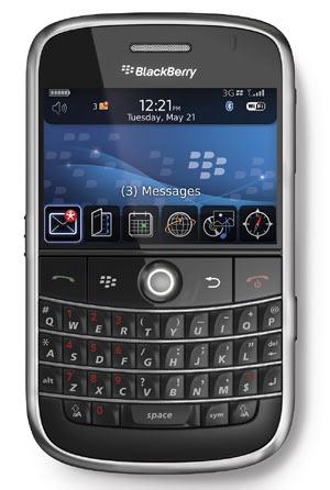

- The platform is loosely based on a more standardized platform (J2ME)
- Even though the platform is quite open, it is still not as popular as it was expected to be
- It is happy to be in its own space, without trying to influence others
 to the dot, which is not to say that it's a bad thing.
Microsoft / Windows Mobile : European Union
The article I had mentioned earlier differentiates Windows and Android in the way they see the device and software partners. Since the beginning, Microsoft has always thrived on a license-and-partner relationship, which has worked to its advantage over the years.


Windows Platform has the following characteristics.
- It works on a partnership model. Everyone pays a license to develop on the platform
- The platform heeds to the needs of the partners and waits till everyone is on board
- The overall fee structure is more expensive compared to other similar platforms
- Change is hard to make and it takes a while to happen as well
Oracle / J2ME : India
Finally, we have the Operating System that most platforms other than those mentioned above, are based on - the Java Micro Edition. I would potentially put Symbian in the same category as well.


Let us look at the defining characteristics and the similarities.
- It's the most open platform compared to all others
- It tries to please everyone and sometimes ends up pleasing no one
- By trying to find a common minimum that will satisfy all devices, it tends to fall short of user expectations, leading users to create their own variant platforms
- Being a 'democratic' system, it has little control over the devices where it is used, leading to significant fragmentation, which in turn, compounds the problem of trying to find a common minimum.
- Even though it is a credible and viable platform, it is outdated and is fast losing its market relevance
While it may take a while for the countries to play out their roles, may be it will be interesting to see how the market reaction is to these mobile platforms, which in turn, may give a good indication of how the world will shape up - and I am not sure if the results we may see in future is something we may like to see ;)


 book. In the book, the authors suggest that in order for an idea to stick in the viewer's mind, it should have the following qualities.